Wide and short or skinny and long?
Yes, we're obviously talking about navigation systems within SaaS products.
Recently, I chose wrong. In this post, I'd like to walk you through my initial thinking, where it went wrong and how I rectified it.
It all started in summer 2023, I had built a technical demo for what became Florm, a logic driven form builder and I was in the process of turning into an actual product.
I scoped out the initial product, there would be the following sections:
- Dashboard
- Forms
- Responses
- Templates
- Team
A user menu with account settings, billing and logout completed it.
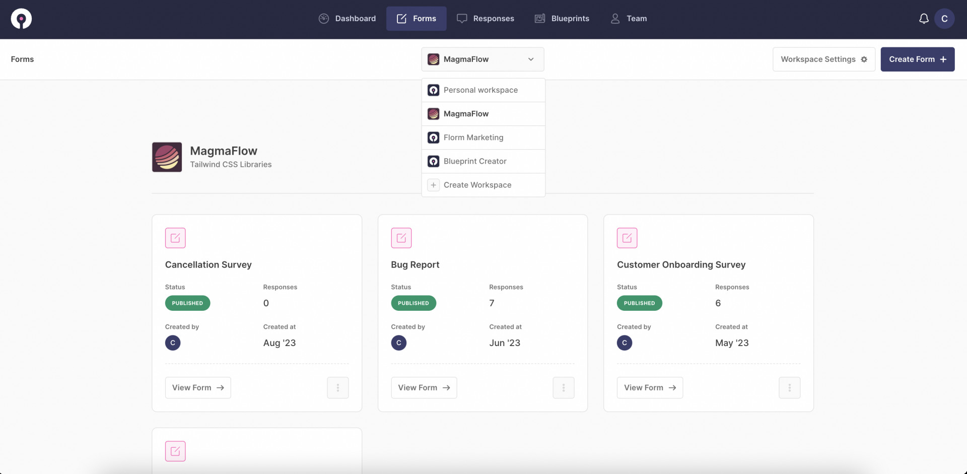
The drag and drop form builder required plenty of screen real estate. With that and my five sections, I thought a horizontal navigation should do the trick and I pressed on with building out the product.
This blasé decision would cause me many a design headache as the product gained traction and started to expand.
These headaches would ultimately stop development entirely.
I had a list of features that needed to be in the product if it was to satisfy user needs, things like:
- Help centre
- Tutorials (Academy)
- Changelog
- Developers
To mention the first few.
I took a step back from feature building to realise I had handicapped myself with this early navigation design.
Sure, I could add page level sub navigations or mega-menus to solve the problem, but it would cause more friction to the usability of the product.
I was also stuck with the layout of interior pages. A horizontal navigation leans towards content within interior pages being placed within a container to help with responsiveness. But then some features like the form builder need to be full width.
It was a whole mess.
The solution was to redesign the application layout from scratch. Instead of horizontal navigation, I chose a side menu. This allowed:
- More vertical space for feature expansion
- Collapsible sections making sub-navigation easy
- More prominent icons and active page states
I know what you're thinking (I mean, you're probably not, but props if you are). Chris! What about the form builder? Doesn't the sidebar eat into the space it needs? The answer is yes, yes it does.
The trick here is to make it collapsible. This means navigational elements such as the side navigation and page header could be restricted to minimum page real estate needed.
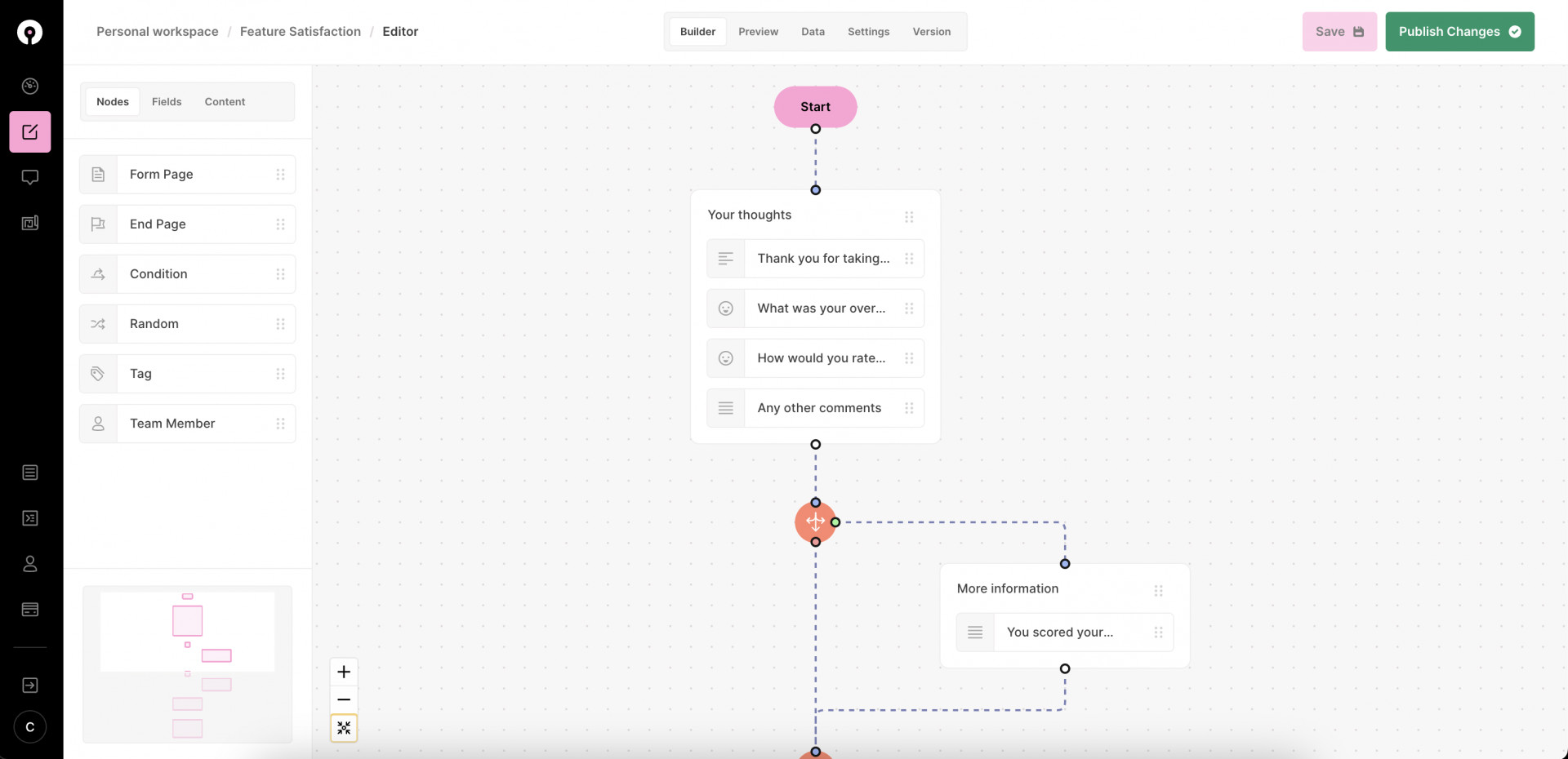
That means more space for features. It also means content can expand to the full width of the page minus an expanded or collapsed side navigation. This ended up giving much more scope for complex features like report building that need the space.
After repositioning the product and doing a slight rebrand, the new navigation was launched.
Development can continue.
Getting this right the first time could have saved so much time. So much energy. So many headaches.
But, I've learnt the hard way.
Now, I do a lot more upfront thinking into how the features I'm designing for today's needs will cause tomorrow's problems.
Peace ✌️